
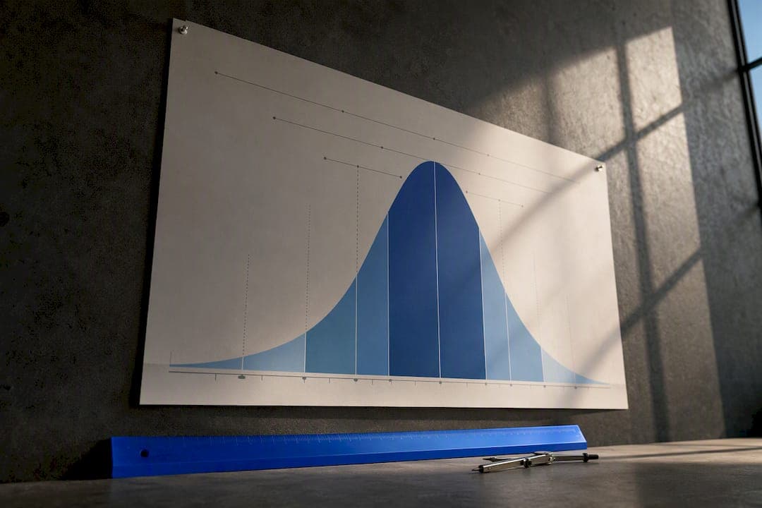
An IQ score chart maps a standard score, built around a mean of 100 and a standard deviation of 15, to a percentile rank and a category label. A score of 100 sits at the midpoint. A 115 lands around the 84th percentile. Every number on the chart carries some margin of error, so a single test result is best read as an estimate, not a verdict.
TL;DR:
- Most IQ scores are estimates with a margin of error of about 3 to 5 points, meaning small score differences often fall within normal measurement variation.
- Scores below 70 or above 145 have wider error margins, making precise percentile ranks less reliable at these extremes.
- A score of 130 or higher roughly corresponds to the top 2% of the population, but cutoff points for labels like gifted or very superior vary between organizations.
- Comparing scores across different tests requires understanding each test's normative scale, especially if they used different standard deviations or editions.
- Scores near critical thresholds, such as 130, should be interpreted with caution, considering confidence intervals and possibly retesting for accuracy.
Table of Contents
- IQ Score Chart: Lookup Table and Visual Explanation
- IQ Classification Table and Common Labels
- Percentiles and the Bell Curve: Reading Percentiles and SD Equivalents
- Wechsler vs Stanford–Binet vs Cattell: Test Differences and Conversions
- Interpreting a Single IQ Result: Confidence Intervals and Retest Variation
- What the Chart Does Not Show and Common Misconceptions
- How to Use This Chart: Practical Next Steps After Seeing a Score
- Reading the Numbers Without Losing the Person Behind Them
- Get Your Own Percentile Ranking in About 15 Minutes
- Sources
IQ Score Chart: Lookup Table and Visual Explanation
The chart below is the one worth bookmarking. It runs from the extremely low end near 40 up through 160, and it pairs each score band with a classification label, the percentile rank at the top of that band, and roughly how much of the population lands there. Most people who search for an IQ score chart want exactly this: a fast way to find their number and see where it sits.
The math behind it is simple once you see it laid out. That structure is what lets psychologists convert a raw score into a percentile using a standard z-table reference.
These figures come from Wikipedia's compiled IQ classification tables, which draw on the same normal-curve math used by test publishers. Half the population, by definition, falls in that 90 to 109 average band. That's not a flaw in the test. It's the entire point of building a scale around a mean of 100.
Here's how to actually read a row. Take the 110–119 band. Someone who scores 118 isn't just "high average" in some vague sense. A 92 isn't a bad score. It's smack in the middle of "average," a hair below the midpoint, and it says almost nothing distinctive about that person's ability.
A few things to keep in mind when you're doing your own lookup:
- The percentile listed is the ceiling of the range, not every score inside it. A 92 and a 109 are both "average," but they sit at different percentiles within that band.
- Population percentages are theoretical, based on a perfect normal distribution. Real test samples wobble slightly from this ideal, which is why different sources round the "average" share to numbers between 45% and 50%.
- Extreme scores (below 55 or above 145) get harder to measure precisely. Fewer people score there, so norm samples thin out and error margins widen.
- Children's scores are typically compared against same-age peers, not the general adult population, which matters if you're reading a child's report card against an adult-normed chart.
Pro Tip: If you're comparing your score against this chart, check what standard deviation your test used before assuming the categories line up. Nearly every modern test uses SD-15, but a few legacy scales didn't, and mixing them up will misplace you by a full category.
IQ Classification Table and Common Labels
The classification bands above aren't arbitrary. They trace back to decades of psychometric convention, and while the numeric cutoffs are fairly standardized now, the labels attached to them have shifted over the decades and still vary slightly between test publishers.
Here's the standard modern breakdown, drawn from the same SD-15 classification system most current tests use:
- Below 70: Extremely low. About 2% of the population. Historically labeled "mentally deficient" or "intellectual disability range," though clinical diagnosis requires more than a single test score.
- 70–79: Borderline. About 7% of people. Older manuals sometimes called this "dull normal," a term almost no modern publisher still uses.
- 80–89: Low average. About 16% of people. Some scales list this simply as "low average" with no further qualifier.
- 90–109: Average. About half of those tested. This is the band most people land in, and it's exactly why the scale was built to center here.
- 110–119: High average. About 16% of people. A few publishers merge this into a broader "above average" category.
- 120–129: Superior. About 7% of people. Older Wechsler manuals used "superior" here specifically; some newer materials say "moderately gifted."
- 130 and above: Very superior. About 2% of people. This is the band that overlaps with the popular idea of "gifted," and it's also Mensa's admission threshold on most accepted tests.
Testuno's platform reports scores using this same SD-15 framework, so an estimate from its IQ test maps directly onto the categories above without any conversion needed.
The labeling inconsistency matters more than people assume. "Gifted" isn't a single, universally agreed threshold. Some school districts set their gifted-program cutoff at 130, others at 125, and a few use 120 combined with other criteria like teacher recommendations. If a chart or article tells you "gifted starts at exactly X," treat that as one organization's policy choice, not a scientific law.
The bottom two-thirds of the distribution get comparatively little attention in popular discussion, which is a little backward given that's where almost everyone actually falls. The "low average" and "borderline" bands together cover close to a quarter of the population, and a score there says far less about someone's day-to-day competence than the label might suggest. These categories were built for clinical and educational triage purposes, like flagging kids who might need extra classroom support, not for ranking human worth.
Percentiles and the Bell Curve: Reading Percentiles and SD Equivalents
Every IQ score is secretly a percentile in disguise.
Here's the mechanism. A z-score measures how many standard deviations a value sits from the mean. On an IQ scale, a z-score of +1.0 corresponds to 115 (100 plus one SD of 15), and a z-score of +2.0 corresponds to 130. Once you have the z-score, a standard normal table converts it directly into a percentile, because IQ scores are built to follow the same bell-curve shape as any other normally distributed measurement.
Quick reference: SD and percentile pairs A score of 85 (minus 1 SD) sits near the 16th percentile. A score of 100 (the mean) sits at the 50th. A score of 115 (plus 1 SD) sits near the 84th. A score of 130 (plus 2 SD) sits near the 98th. A score of 145 (plus 3 SD) sits above the 99.9th.
A worked example makes this concrete. Say someone scores 122. Subtract the mean (100) to get 22, then divide by the standard deviation (15), giving a z-score of about 1.47. That's the entire process test publishers use to generate the percentile printed on a score report, just automated.
A few practical notes on working with z-scores and percentiles:
- Percentiles compress at the extremes. The jump from 130 to 145 looks small on the IQ scale (15 points) but represents a huge percentile leap, from about the 98th to above the 99.9th, because so few people score up there.
- The same logic works in reverse for low scores. A 70 sits at roughly the 2nd percentile, meaning 98% of people score higher, which is why that threshold gets used as a clinical marker.
- Percentile and "percent correct" are not the same thing. A percentile compares you to other test takers; it has nothing to do with what fraction of test questions you answered correctly.
- Different tests can produce slightly different percentiles for the same raw performance, because each test norms against its own reference sample rather than a single universal population.
This is also where the top 2% benchmark that Mensa uses comes from directly. Two standard deviations above the mean is, by definition, close to the 98th percentile on a normal curve, which is why 130 shows up so consistently as the cutoff people associate with "genius" level thinking, even though no test publisher officially uses that word.
Wechsler vs Stanford–Binet vs Cattell: Test Differences and Conversions
Most modern intelligence tests, including the Wechsler Adult Intelligence Scale, the Stanford–Binet Intelligence Scales, and Cattell's culture-fair tests, use a deviation IQ built around a mean of 100 and a standard deviation of 15. That shared scaling is exactly why a chart like the one above can serve as a rough universal reference across tests, even though each test measures somewhat different cognitive skills.
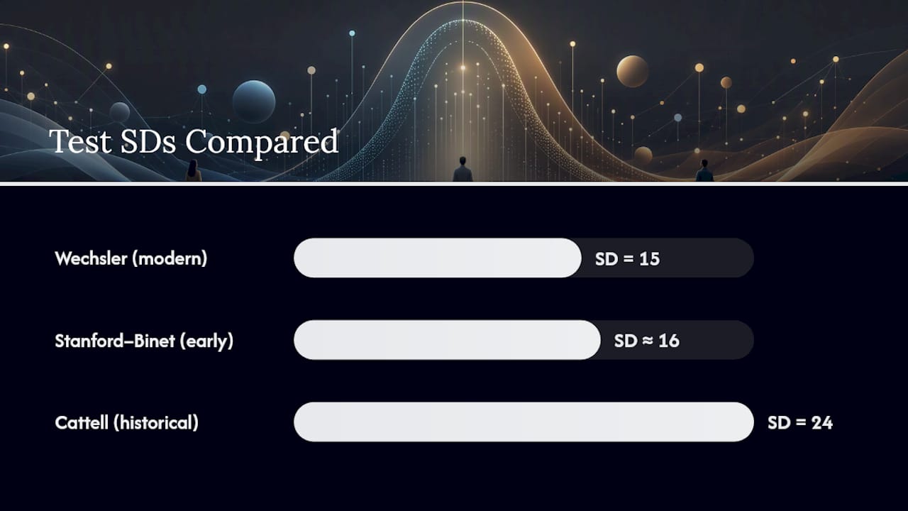
That wasn't always true, though, and it still trips people up when they compare old scores to new ones. Early versions of the Stanford–Binet used a ratio IQ with a standard deviation closer to 16, and some Cattell scales historically ran with a standard deviation of 24, which stretches the percentile-to-score mapping considerably. A "130" on one of those older scales does not automatically mean the same percentile as a 130 on a current SD-15 test.
Here's what actually differs between the major named tests:
- Wechsler scales (WAIS for adults, WISC for children) break the full score into index scores like verbal comprehension and working memory, giving a profile rather than a single number.
- Stanford–Binet emphasizes fluid reasoning and working memory across age bands, and has gone through multiple revisions that changed its scoring model over the decades.
- Cattell tests were designed to be less dependent on language and cultural background, using abstract pattern and figure reasoning instead of vocabulary or verbal analogies.
- Organizations like Mensa accept a specific list of standardized, supervised tests for admission, and the accepted threshold is consistently framed as "the top 2%" rather than a fixed number, precisely because different tests need different raw cutoffs to hit that same percentile.
The practical takeaway: if you're comparing a score from one test against a chart built for another, check what scale and edition it used before assuming the numbers line up perfectly. Precise cross-test conversion depends on the specific norms of each edition, and a psychologist doing a formal comparison would use published conversion tables rather than eyeballing it. For casual comparison, the SD-15 chart above is a solid working reference for the vast majority of tests people encounter today, including Testuno's own IQ test, which reports scores on that same standard scale.
Interpreting a Single IQ Result: Confidence Intervals and Retest Variation
A single IQ score is an estimate with a margin of error, not a fixed measurement carved in stone. The technical term for that margin is the standard error of measurement, or SEM, and it exists because no test perfectly captures the trait it's measuring. Fatigue, mood, familiarity with test format, and simple chance all nudge a score up or down slightly from one sitting to the next.
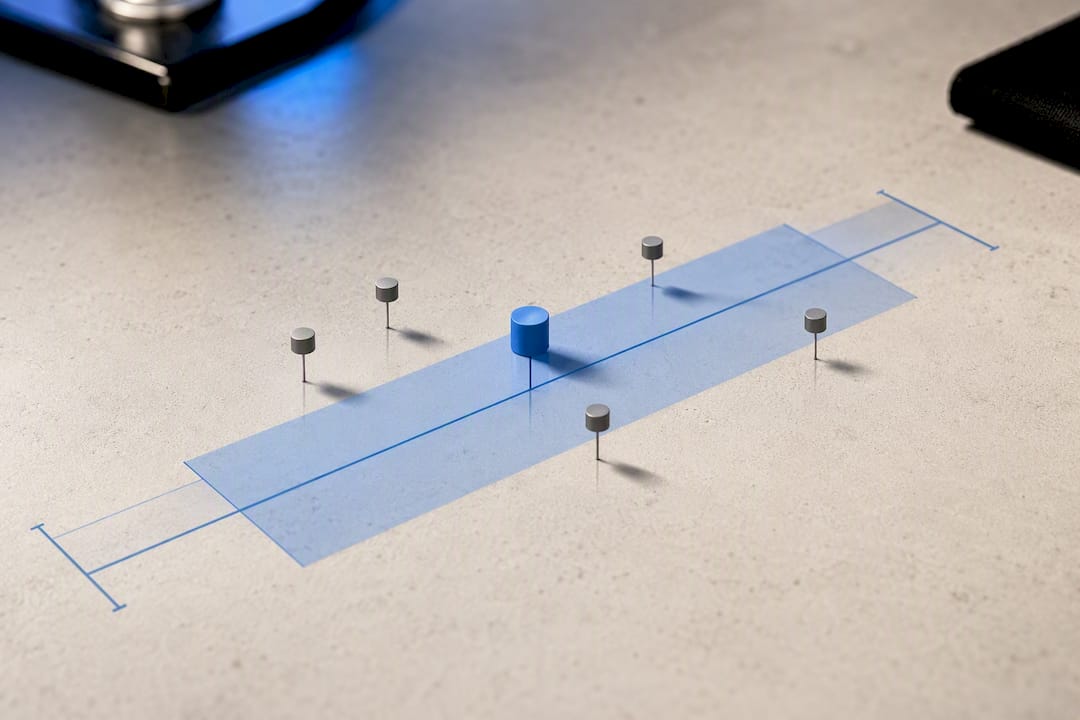
Psychometric reliability research shows that SEM varies by test and even by subtest, but it's commonly discussed in the range of 3 to 5 points on major IQ scales. That means a reported score of 115 doesn't mean "exactly 115." It means the person's true score most likely falls somewhere in a band around that number.
Here's how that plays out with a concrete example:
- Start with the reported score: 115.
- Apply a typical SEM of about 3 points to build a 68% confidence interval, meaning there's roughly a two-in-three chance the true score falls between 112 and 118.
- Widen to a 95% confidence interval by doubling the SEM, giving a range of roughly 109 to 121, which is where most clinicians expect the true score to fall with high confidence.
- Notice that this range spans across two classification bands (average and high average), which is exactly why a single score shouldn't be treated as a precise label.
That widening range is the single most misunderstood part of any IQ score chart discussion. People treat 115 as if it's categorically different from 112, when the two numbers are statistically almost indistinguishable given normal measurement error.
Pro Tip: If you take an IQ test twice and get scores that differ by 5 to 8 points, that's not necessarily a sign anything went wrong. That gap often falls within normal retest variation, especially for shorter or informal assessments.
A few situations call for more than a single quick score:
- Low reliability subtests. Some subtests, particularly ones measuring processing speed or short attention spans, tend to show more day-to-day fluctuation than reasoning-heavy sections.
- High-stakes decisions. Anything tied to special education placement, disability determination, or legal proceedings warrants a full clinical evaluation by a licensed psychologist, not a single online estimate.
- Scores near a cutoff. If a score sits right at a threshold, like 129 next to a 130 gifted cutoff, the confidence interval alone should tell you that a retest or fuller battery is worth considering before treating the label as settled.
None of this means quick self-assessments are worthless. It means they're best treated as a snapshot rather than a diagnosis, useful for curiosity, informal benchmarking, or a starting point before deciding whether to pursue something more formal.
What the Chart Does Not Show and Common Misconceptions
An IQ chart measures a fairly narrow slice of cognitive ability: pattern recognition, working memory, processing speed, and reasoning under timed conditions. It says nothing about creativity, emotional intelligence, motivation, work ethic, or how good someone is at their actual job. A review of intelligence testing literature is direct about this: IQ correlates with certain academic and occupational outcomes, but it's one input among many, not a complete forecast of anyone's future.
The chart also doesn't account for context, and that context matters more than most people assume:
- Language and cultural background shape performance on verbal subtests in particular, which is part of why culture-reduced tests like Cattell's were developed in the first place.
- Socioeconomic factors, including access to quality education and even nutrition and sleep during childhood, measurably affect test performance independent of underlying ability.
- Test anxiety and unfamiliarity with format can knock several points off a score without reflecting anything about real cognitive capacity.
- "Gifted" and "genius" are not clinical or scientific terms. They're popular labels loosely tied to the top percentile bands, and no professional body has an official, universal definition for either one.
There's also a real overlap worth naming directly: some children and adults flagged as gifted also show traits associated with autism spectrum conditions, and the two get confused more often than people realize, since intense focus, unusual reasoning patterns, or social differences can look similar on the surface but stem from very different underlying profiles. A detailed comparison of giftedness and autism is worth reading for parents or teachers trying to sort out which explanation actually fits a specific kid.
The biggest misconception, though, is treating a single number as a verdict on someone's worth or potential. It isn't. It's a snapshot of performance on a specific set of tasks, on a specific day, compared against a specific reference group. Read it that narrowly and the chart becomes genuinely useful. Read it any more broadly and it starts making promises the number was never built to keep.
How to Use This Chart: Practical Next Steps After Seeing a Score
Getting a number is the easy part. What you do with it depends heavily on why you took the test in the first place.
- Confirm the test type and norms. Before comparing your score to this chart, verify it used a standard SD-15 scale, since older or informal tests sometimes don't.
- Weigh whether a retest makes sense. If your score surprised you, sits near a meaningful cutoff, or came from a short, informal assessment, a second test on a different day gives you a better read than a single sitting.
- Decide if the stakes call for a professional. For casual curiosity, an online estimate like Testuno's quick IQ test is plenty. For school placement, workplace accommodations, or anything with legal weight, a licensed psychologist administering a full battery is the right call.
- Gather supporting documentation if you're presenting a score formally. Schools and employers generally want to know which test was used, when it was administered, and by whom, not just the raw number.
- Consider targeted follow-up testing if a specific skill is in question. A single global score can mask big gaps between subskills, so tools that isolate numerical reasoning or working memory can clarify where strengths and weaknesses actually sit.
If your goal is understanding your general cognitive profile rather than chasing a single number, it's worth looking at the subtests underneath the composite score. A high overall IQ with one weak subtest tells a very different story than the same overall score built evenly across every category. That's the kind of nuance a chart alone can't give you, but a fuller test report usually can.
Reading the Numbers Without Losing the Person Behind Them
IQ charts are genuinely useful, and I'd push back on anyone who dismisses them as pseudoscience. The statistics behind them are solid, well-documented, and consistent across nearly every major test publisher. What I'd push back on just as hard is the way people use the chart once they have a number in hand, turning a percentile estimate into a permanent identity.
The most overlooked detail in this whole topic is the confidence interval. People fixate on whether they scored 118 or 122 as if that four-point gap means something, when statistically it barely moves the needle. The category labels matter more than the exact digit, and even the categories are softer boundaries than they look on a chart.
Testuno built its flagship IQ test around six research-grounded subtests specifically so users get more than one flat number, they get a percentile ranking and a breakdown across subskills, in about 15 minutes with no sign-up required. That's not a substitute for a clinical evaluation when one is actually needed. It's a fast, honest way to see where you stand and decide whether digging deeper is worth your time.
— Steve
Get Your Own Percentile Ranking in About 15 Minutes
If you've been running your own score through the chart above, the next logical step is getting a number worth checking against it. Testuno's IQ test runs six research-grounded subtests and reports back an estimated IQ with a percentile ranking, using the same SD-15 framework covered throughout this guide, so there's no conversion guesswork afterward.
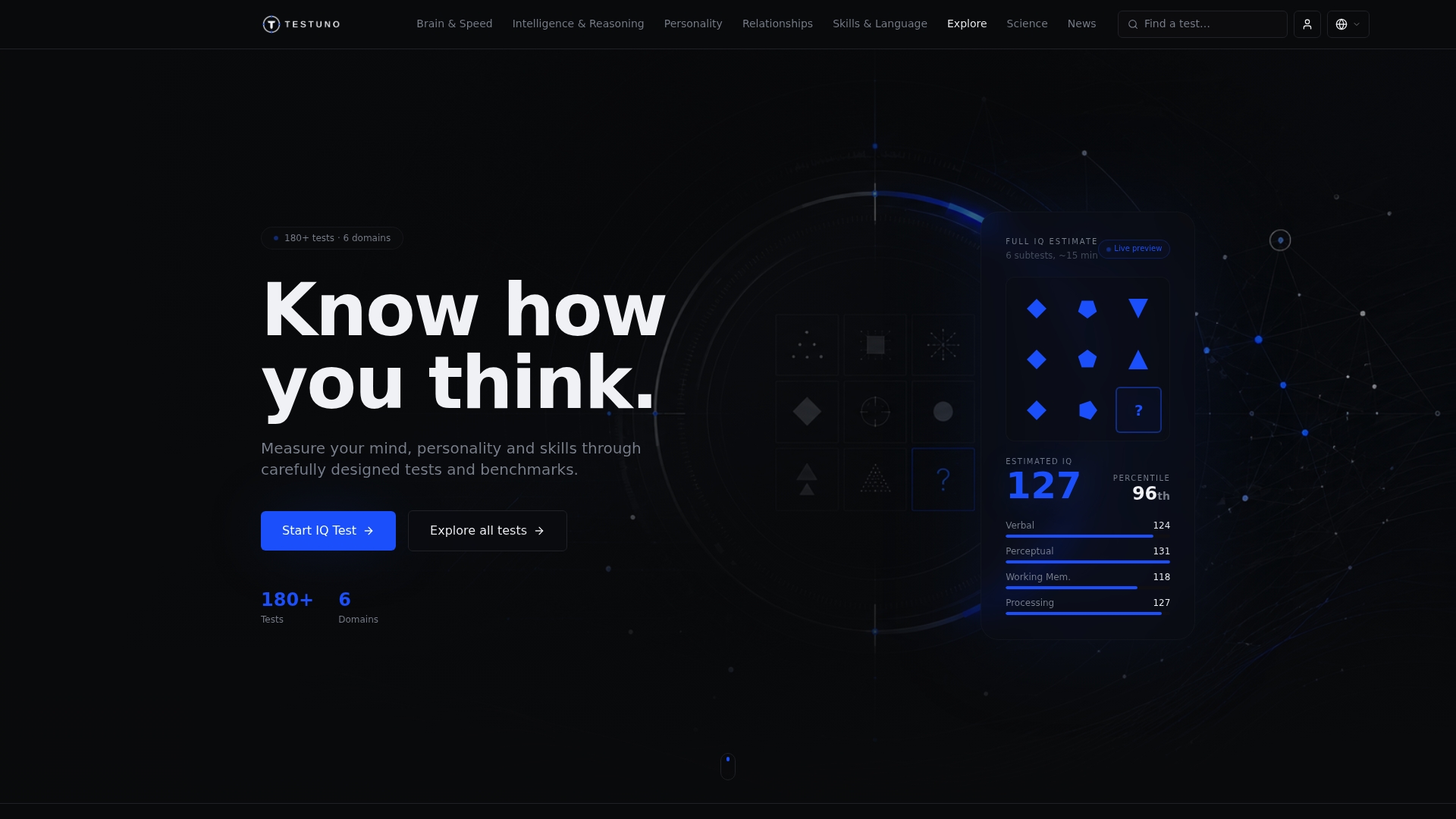
Testuno isn't positioned as a replacement for a full clinical evaluation, and it doesn't pretend to be one. It's a fast, no-sign-up way to get a real benchmark, complete with a downloadable report, when you want a solid number to work with before deciding whether formal testing makes sense for your situation. If you'd rather start with something shorter, the quick IQ test gives you a lighter-weight estimate in a few minutes, and the nonverbal IQ test is worth trying if you want a benchmark that leans less on language and vocabulary. Pick one, take fifteen minutes, and see exactly where your number lands on the chart you just read.
Sources
- IQ classification — Wikipedia
- What is IQ? — Mensa International
- Z-table reference — University at Albany
- PubMed — psychometric reliability studies